The POSSIBLE logo expresses the company’s philosophy and the visual embodiment of its identity.
As the core of our corporate design, the logo is:
- A statement
- A vision
- Concise
- Clear
- Pure
- Unobtrusive
- Approachable
Save the Date • April 5-7, 2027

As the core of our corporate design, the logo is:
Includes: AI, EPS, PDF, SVG and PNG files
The preferred logo to use is:
“POSSIBLE-Logo_color”
Primary: POSSIBLE
The logo can be divided into its individual components depending on the purpose and to avoid duplication in the design.
All elements can stand alone, except the Word Mark and MMA Global / Hyve Event addition. This addition must remain linked to the image mark of the POSSIBLE logo.
The specified proportions and distances must always be observed.
The company must be identified by the logo pictured here in all publications, such as corporate stationery and printed materials, in all visual electronic media and on all products and packaging.
The relative proportions of the word mark must never be altered. To ensure prominence and legibility, the POSSIBLE logo is always surrounded by an area of clear space which remains free of other elements, such as type and other graphics. The minimum area of clear space is illustrated here by a rectangular box containing the POSSIBLE logo. This box is not to be printed. Its construction is based on the height of the lowercase letters “pb” from the POSSIBLE word mark. These grey elements are for the construction of the clear space only and are also not to be printed. The clear space area is a minimum requirement and should be increased wherever possible.
Within the POSSIBLE identity, a Co-Branded Logo featuring the POSSIBLE logo alongside another sponsor’s logo may be used to showcase our adaptability in collaborating with various event partners.
This logo variation is ideal for internal documents, on-site signage, and any necessary and agreed upon co-branded marketing materials.
The use of the colored version of the logo is the preferred approach.
The logo can be placed on various backgrounds as long as maximum clarity and legibility is ensured even at small sizes. The higher the contrast of the logo to the background, the better it stands out against it. It is recommended to use monochrome, calm backgrounds and to give the logo generous space to breathe: at least the size of the defined clear space.
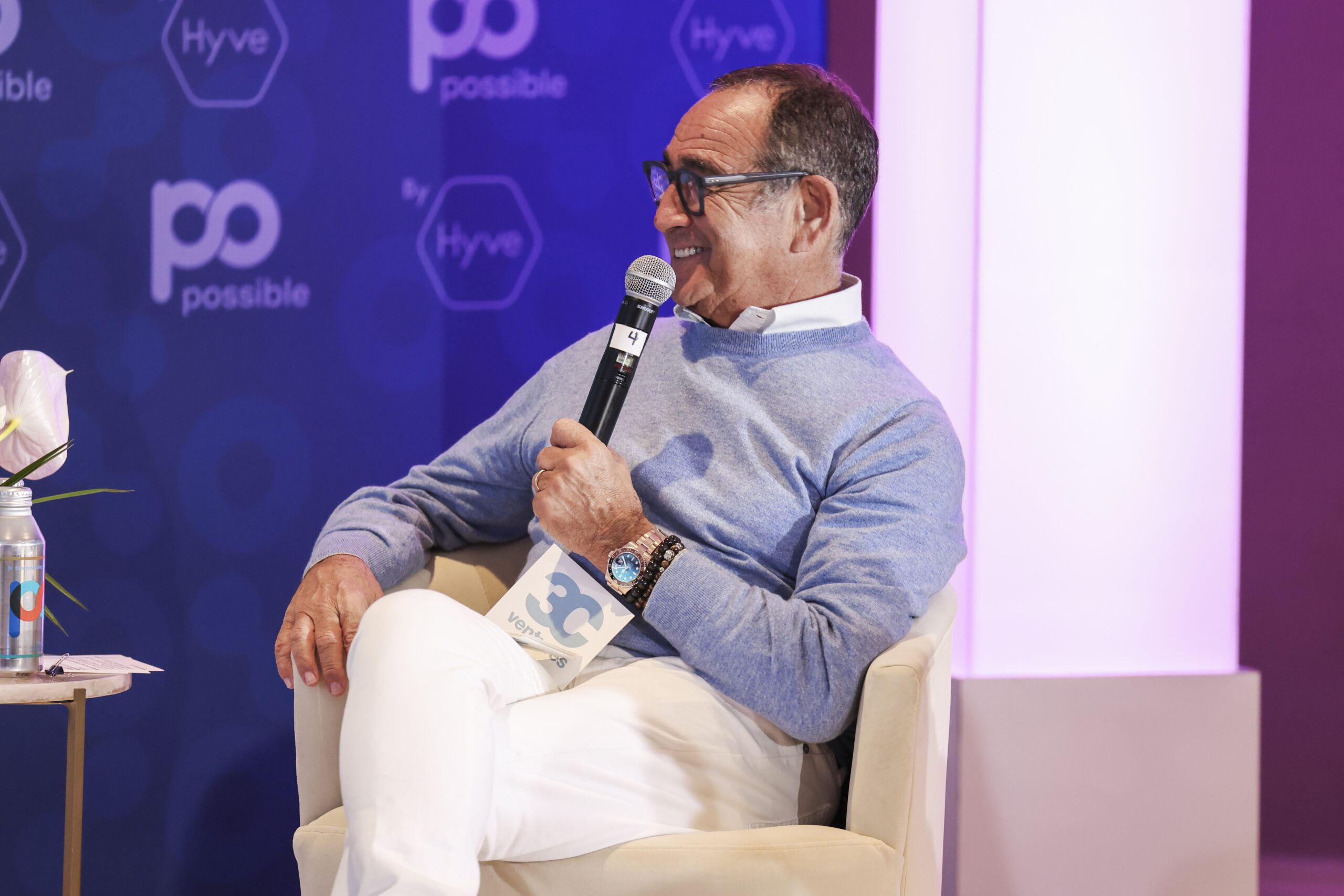
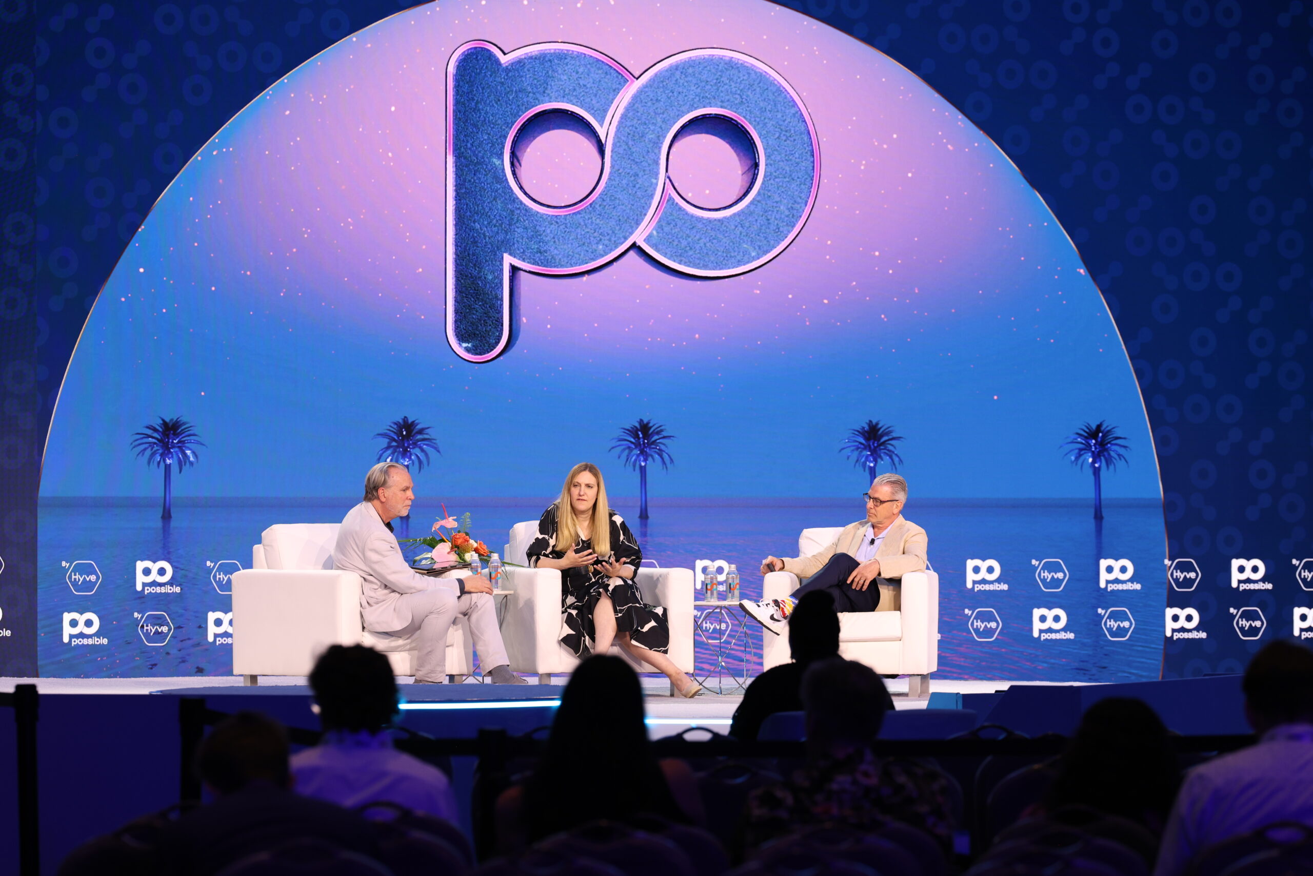
The logo can also be placed on pictures. In such cases, please ensure that the contrast with the picture background is sufficient and that maximum clarity and legibility is maintained.
The logo can be used in different color variations. The illustration in primary colors is preferred. Depending on the background, a monochrome or black and white image should be chosen.